#javascript gsap
Explore tagged Tumblr posts
Visit Tumblr Blog
Explore Tumblr blogs with no restrictions, modern design and the best experience.
Last Seen Tumblr Blogs


Fun Fact
China blocked Tumblr because of pornography and censorship problems in 2013.
Text

Parallax Photo Carousel using HTML CSS JS
#parallax photo slider#image slider#codingflicks#html css#learn to code#code#frontend#html#css#css3#javascript slider#javascript snippets#javascript gsap#gsap
0 notes
Text
Discover how to enhance user experience with web animations. Learn about different types, best practices, and tools like CSS, GSAP, and SVG animations to create engaging, interactive websites.
#WebDesign#UIUX#WebAnimation#CSSAnimation#JavaScript#GSAP#SVGAnimation#UserExperience#DigitalDesign#WebDevelopment
0 notes
Text
Learn how to create a slider using GSAP

Introduction
In this tutorial, we will walk you through the process of creating a stunning slider called "Voyage Slider" using the GSAP (GreenSock Animation Platform) library. This slider allows you to showcase images and information about various travel destinations in a visually appealing way. Before we dive into the code, you can preview the final result by checking out the demo here. See the Pen Voyage Slider | GSAP by Sikriti Dakua (@dev_loop) on CodePen.
Getting Started
Before we start coding, make sure you have the following prerequisites: - A text editor (e.g., Visual Studio Code, Sublime Text) - Basic knowledge of HTML, CSS, and JavaScript - An internet connection to load external libraries
HTML Structure
Let's begin by setting up the HTML structure for our Voyage Slider: HTML ... ... ... ... ... ... Ensure you have the necessary CSS classes and IDs for styling and JavaScript interactions.
CSS Styles
Next, include the CSS styles needed for the slider. You can link to an external CSS file or include the styles within a " style="color:#F8F8F2;display:none" aria-label="Copy" class="code-block-pro-copy-button"> /* Add your CSS styles here */
JavaScript Code
Now, let's add the JavaScript code that makes the Voyage Slider come to life: JavaScript console.clear(); const { gsap, imagesLoaded } = window; const buttons = { prev: document.querySelector(".btn--left"), next: document.querySelector(".btn--right"), }; const cardsContainerEl = document.querySelector(".cards__wrapper"); const appBgContainerEl = document.querySelector(".app__bg"); const cardInfosContainerEl = document.querySelector(".info__wrapper"); buttons.next.addEventListener("click", () => swapCards("right")); buttons.prev.addEventListener("click", () => swapCards("left")); function swapCards(direction) { const currentCardEl = cardsContainerEl.querySelector(".current--card"); const previousCardEl = cardsContainerEl.querySelector(".previous--card"); const nextCardEl = cardsContainerEl.querySelector(".next--card"); const currentBgImageEl = appBgContainerEl.querySelector(".current--image"); const previousBgImageEl = appBgContainerEl.querySelector(".previous--image"); const nextBgImageEl = appBgContainerEl.querySelector(".next--image"); changeInfo(direction); swapCardsClass(); removeCardEvents(currentCardEl); function swapCardsClass() { currentCardEl.classList.remove("current--card"); previousCardEl.classList.remove("previous--card"); nextCardEl.classList.remove("next--card"); currentBgImageEl.classList.remove("current--image"); previousBgImageEl.classList.remove("previous--image"); nextBgImageEl.classList.remove("next--image"); currentCardEl.style.zIndex = "50"; currentBgImageEl.style.zIndex = "-2"; if (direction === "right") { previousCardEl.style.zIndex = "20"; nextCardEl.style.zIndex = "30"; nextBgImageEl.style.zIndex = "-1"; currentCardEl.classList.add("previous--card"); previousCardEl.classList.add("next--card"); nextCardEl.classList.add("current--card"); currentBgImageEl.classList.add("previous--image"); previousBgImageEl.classList.add("next--image"); nextBgImageEl.classList.add("current--image"); } else if (direction === "left") { previousCardEl.style.zIndex = "30"; nextCardEl.style.zIndex = "20"; previousBgImageEl.style.zIndex = "-1"; currentCardEl.classList.add("next--card"); previousCardEl.classList.add("current--card"); nextCardEl.classList.add("previous--card"); currentBgImageEl.classList.add("next--image"); previousBgImageEl.classList.add("current--image"); nextBgImageEl.classList.add("previous--image"); } } } function changeInfo(direction) { let currentInfoEl = cardInfosContainerEl.querySelector(".current--info"); let previousInfoEl = cardInfosContainerEl.querySelector(".previous--info"); let nextInfoEl = cardInfosContainerEl.querySelector(".next--info"); gsap.timeline() .to(, { duration: 0.2, opacity: 0.5, pointerEvents: "none", }) .to( currentInfoEl.querySelectorAll(".text"), { duration: 0.4, stagger: 0.1, translateY: "-120px", opacity: 0, }, "-=" ) .call(() => { swapInfosClass(direction); }) .call(() => initCardEvents()) .fromTo( direction === "right" ? nextInfoEl.querySelectorAll(".text") : previousInfoEl.querySelectorAll(".text"), { opacity: 0, translateY: "40px", }, { duration: 0.4, stagger: 0.1, translateY: "0px", opacity: 1, } ) .to(, { duration: 0.2, opacity: 1, pointerEvents: "all", }); function swapInfosClass() { currentInfoEl.classList.remove("current--info"); previousInfoEl.classList.remove("previous--info"); nextInfoEl.classList.remove("next--info"); if (direction === "right") { currentInfoEl.classList.add("previous--info"); nextInfoEl.classList.add("current--info"); previousInfoEl.classList.add("next--info"); } else if (direction === "left") { currentInfoEl.classList.add("next--info"); nextInfoEl.classList.add("previous--info"); previousInfoEl.classList.add("current--info"); } } } function updateCard(e) { const card = e.currentTarget; const box = card.getBoundingClientRect(); const centerPosition = { x: box.left + box.width / 2, y: box.top + box.height / 2, }; let angle = Math.atan2(e.pageX - centerPosition.x, 0) * (35 / Math.PI); gsap.set(card, { "--current-card-rotation-offset": `${angle}deg`, }); const currentInfoEl = cardInfosContainerEl.querySelector(".current--info"); gsap.set(currentInfoEl, { rotateY: `${angle}deg`, }); } function resetCardTransforms(e) { const card = e.currentTarget; const currentInfoEl = cardInfosContainerEl.querySelector(".current--info"); gsap.set(card, { "--current-card-rotation-offset": 0, }); gsap.set(currentInfoEl, { rotateY: 0, }); } function initCardEvents() { const currentCardEl = cardsContainerEl.querySelector(".current--card"); currentCardEl.addEventListener("pointermove", updateCard); currentCardEl.addEventListener("pointerout", (e) => { resetCardTransforms(e); }); } initCardEvents(); function removeCardEvents(card) { card.removeEventListener("pointermove", updateCard); } function init() { let tl = gsap.timeline(); tl.to(cardsContainerEl.children, { delay: 0.15, duration: 0.5, stagger: { ease: "power4.inOut", from: "right", amount: 0.1, }, "--card-translateY-offset": "0%", }) .to(cardInfosContainerEl.querySelector(".current--info").querySelectorAll(".text"), { delay: 0.5, duration: 0.4, stagger: 0.1, opacity: 1, translateY: 0, }) .to( , { duration: 0.4, opacity: 1, pointerEvents: "all", }, "-=0.4" ); } const waitForImages = () => { const images = ; const totalImages = images.length; let loadedImages = 0; const loaderEl = document.querySelector(".loader span"); gsap.set(cardsContainerEl.children, { "--card-translateY-offset": "100vh", }); gsap.set(cardInfosContainerEl.querySelector(".current--info").querySelectorAll(".text"), { translateY: "40px", opacity: 0, }); gsap.set(, { pointerEvents: "none", opacity: "0", }); images.forEach((image) => { imagesLoaded(image, (instance) => { if (instance.isComplete) { loadedImages++; let loadProgress = loadedImages / totalImages; gsap.to(loaderEl, { duration: 1, scaleX: loadProgress, backgroundColor: `hsl(${loadProgress * 120}, 100%, 50%`, }); if (totalImages == loadedImages) { gsap.timeline() .to(".loading__wrapper", { duration: 0.8, opacity: 0, pointerEvents: "none", }) .call(() => init()); } } }); }); }; waitForImages(); Make sure to replace the comment placeholders with your actual code.
CSS Styles
Let's continue by adding the CSS styles for your Voyage Slider. You can include these styles within a " style="color:#F8F8F2;display:none" aria-label="Copy" class="code-block-pro-copy-button"> /* Import Google Fonts */ @import url("https://fonts.googleapis.com/css2?family=Montserrat:wght@500;600;700;800&display=swap"); /* Define CSS variables for customization */ :root { --card-width: 200px; --card-height: 300px; --card-transition-duration: 0.8s; --card-transition-easing: ease; } /* Reset default styles */ * { box-sizing: border-box; margin: 0; padding: 0; } /* Add your CSS styles here */ /* ... */
Conclusion
Congratulations! You have successfully learned how to create the Voyage Slider using HTML, CSS, and GSAP. This slider can enhance the visual appeal of your website and engage your audience with stunning travel destination images. Feel free to customize the slider further and integrate it into your web projects to showcase your own content.
Additional Resources
If you want to explore more about GSAP animations and web development, here are some helpful resources: - GSAP Documentation - Official GSAP documentation for in-depth learning. - MDN Web Docs - A comprehensive resource for web development. - CodePen - Explore and experiment with code snippets and projects. Thank you for following this Voyage Slider tutorial. If you have any questions or feedback, please don't hesitate to reach out. Happy coding! Read the full article
0 notes
Text
Creative Coding: Shaping the Future of Web Development in Ahmedabad
In the fast-moving digital age, websites are more than just online brochures; they're interactive platforms that shape customer experiences, build trust, and drive sales. And as businesses increasingly rely on the web to connect with users, web development services in Ahmedabad are taking center stage.
Ahmedabad, once known primarily for textiles and heritage, is now a thriving digital innovation hub. From startups to large enterprises, businesses across industries are turning to skilled web developers to create visually stunning, high-performance websites that stand out in crowded digital spaces.
But what’s powering this transformation? The answer lies in creative coding, a fusion of logic and design, where web developers blend technical expertise with artistic thinking to craft unforgettable digital experiences.
In this article, we’ll dive deep into how creative coding is revolutionizing web development services in Ahmedabad, the tools and trends leading this evolution, and why businesses can’t afford to ignore it in 2025 and beyond.
What Is Creative Coding?
Creative coding refers to the practice of using code not just to make websites function—but to make them come alive.
This approach combines traditional development skills (like HTML, CSS, JavaScript, backend logic) with artistic elements like animation, interactivity, 3D visuals, and custom graphics. The result? Websites that don’t just inform but wow visitors.
Instead of static, templated layouts, developers use creative coding to:
Animate elements as users scroll
Build immersive storytelling pages
Integrate motion graphics or WebGL
Create responsive interactions based on user behavior
This style of development is transforming how users engage with websites and Ahmedabad is quickly emerging as a hotspot for this new digital craft.
Why Ahmedabad? The Rise of a Digital Powerhouse
Ahmedabad didn't become a digital tech hub in a day. Over the past 10 years, the city has gone through:
A surge in IT parks and startup incubators
Skilled tech graduates from institutes like Nirma University and DAIICT
Affordable cost structures for development work
Global clientele outsourcing to Ahmedabad-based firms
Strong support from the Gujarat government’s Digital India push
These factors have created the perfect ecosystem for innovation in web development.
Today, you’ll find Ahmedabad-based agencies building everything from corporate websites and eCommerce platforms to interactive art portfolios and immersive storytelling websites all powered by creative coding.
How Creative Coding Is Changing Web Development
Let’s explore how creative coding is driving the next wave of web development services in Ahmedabad.
1. Immersive User Experiences
Gone are the days of static websites. Now, users want dynamic, scroll-triggered animations, 3D visuals, and micro-interactions that feel smooth and engaging.
Developers are leveraging:
GSAP (GreenSock Animation Platform) for fluid animations
Three.js for creating 3D elements in-browser
Framer Motion and Lottie for stunning motion effects
With these tools, Ahmedabad-based developers create memorable digital journeys that reflect brand identity and hook users within seconds.
2. Personalized Interactions
Today's websites monitor user behavior and adjust the experience instantly to match their needs.
Creative coding allows developers to:
Change visuals based on user location or behavior
Load content dynamically
Build intelligent interfaces that “talk” to the user
Use parallax effects and scroll-based animations for storytelling
These enhancements increase dwell time and conversion rates especially for brands in fashion, tech, education, and hospitality.
3. Cross-Device Consistency
Whether someone visits your site on a laptop, tablet, or mobile, the experience needs to feel seamless. Creative coders optimize everything from loading speed to touch gestures.
Using responsive frameworks and creative logic, they ensure:
Layouts adapt fluidly across devices
Animations feel natural on all screen sizes
Touch-based interactivity is smooth and intuitive
This commitment to design thinking sets Ahmedabad’s developers apart from generic, template-based solutions.
4. SEO and Performance Are Still Key
While creativity is important, performance and SEO can’t be ignored. That’s why the best web development services in Ahmedabad follow Google’s Core Web Vitals and SEO guidelines, ensuring:
Fast load times
Optimized assets (images, fonts, videos)
Proper HTML semantics for accessibility
Structured metadata and schema markup
Clean, secure, scalable code
In other words, you get beauty and brains in one package.

Real-World Use Cases from Ahmedabad
Let’s look at how creative coding is helping real businesses in Ahmedabad:
An Art Gallery Website
Using JavaScript canvas and WebGL, developers built an interactive gallery with 360° views of artwork, real-time zoom features, and hover-triggered animations.
Fashion eCommerce Store
A Shopify-based fashion brand worked with a creative team to develop animated lookbooks, AR try-on features, and personalized styling tips, resulting in a 35% increase in average session time.
Healthcare Platform
A hospital worked with a web development company in Ahmedabad to build a platform that included animated patient onboarding, a live chatbot, and support for multiple languages making it easier to connect with patients in rural areas.
Tools Used by Creative Coders in Ahmedabad
Here's what’s commonly used:
HTML5 & CSS3 – for structure and advanced styling
JavaScript/TypeScript – core scripting language
React.js & Vue.js – for building interactive UI
GSAP & Anime.js – for professional animations
Three.js & WebGL – for 3D visuals
TailwindCSS & Bootstrap – responsive design frameworks
Figma/Adobe XD – UI/UX design prototyping
Headless CMS (e.g., Strapi, Contentful) – for scalable content
The use of these tools reflects a global standard making Ahmedabad developers competitive worldwide.
Why Businesses Should Choose Web Development Services in Ahmedabad
So why should you consider hiring from Ahmedabad?
Cost-effective without compromising quality Wide talent pool with up-to-date tech skills Experience in both Indian and international markets Strong focus on design + functionality Quick turnaround time and reliable communication
From startups looking to launch MVPs to enterprises seeking robust portals Ahmedabad delivers scalable solutions with creative flair.
How to Choose the Right Development Partner
Not all agencies are created equal. To make the most of your investment, look for a web development partner who:
Offers end-to-end service
Has a strong portfolio of creative, performance-optimized websites
Uses modern tech stacks and is open to new innovations
Communicates well and meets deadlines
Understands your industry and goals
A reliable web development company in Ahmedabad will not just execute your idea, they'll elevate it.
FAQs
1. How much do web development services in Ahmedabad cost?
It depends on complexity, features, and design requirements. Basic websites may cost ₹20,000–₹50,000. Custom interactive sites can range from ₹1 lakh to ₹5 lakh or more. Always request a detailed quote.
2. How long does it take to build a creative website?
A simple static site may take 1–2 weeks. A creative, custom-coded site with animations and integrations may take 4–8 weeks depending on feedback cycles and revisions.
3. Will my website be mobile-friendly and SEO-optimized?
Yes. Top web development services in Ahmedabad ensure websites are responsive, SEO-ready, and aligned with Google’s performance metrics like Core Web Vitals.
4. What industries can benefit from creative coding in web development?
Creative coding adds value across industries fashion, education, healthcare, travel, SaaS, art & culture, architecture, and more. Any business that values engagement and first impressions can benefit.
Final Thoughts
Web development isn't just about making websites anymore it's about creating engaging user experiences. And web development services in Ahmedabad are leading this movement by combining code with creativity, logic with design, and aesthetics with performance.
Whether you’re launching a new brand, reimagining your online presence, or scaling your digital operations, don’t settle for templates or boring designs. Step into the new age of web development, where each line of code helps shape a unique story.
Let Ahmedabad’s creative developers shape your brand’s next chapter on the web.
0 notes
Text
The Role of Motion UI in Web Development: Adding Delight to UX
In the age of digital-first interactions, user expectations are higher than ever. They don’t just want fast-loading websites—they want smooth, intuitive, and engaging experiences. One of the most powerful tools to achieve this is Motion UI—the strategic use of animations and transitions to guide, inform, and delight users.
Modern Web Development Company teams are increasingly integrating Motion UI into their workflow not just to make interfaces look good, but to enhance usability, improve storytelling, and make digital experiences feel more human. When used well, Motion UI turns static screens into dynamic journeys that users enjoy navigating.
What Is Motion UI?
Motion UI refers to the use of animated elements within a digital interface to convey meaning, improve interaction, and enhance aesthetic appeal. It includes elements like:
Smooth page transitions
Micro-interactions (e.g., button hover effects, toggles, loading spinners)
Scroll-triggered animations
Modal or menu reveals
Feedback animations (e.g., shake effect on invalid form input)
Unlike flashy or distracting animations, Motion UI is subtle, purposeful, and user-centric.
Why Motion UI Matters in Modern Web Development
1. Guiding User Attention
In a visually noisy digital space, animations can help direct the user’s eye to what matters most. Whether it’s drawing attention to a CTA, highlighting a newly loaded section, or showing the progress of a task, motion cues subtly guide behavior without overwhelming the user.
Why it matters: Strategic motion reduces cognitive load and enhances information hierarchy.
2. Providing Feedback and Affordance
Users feel more confident when the interface responds to their actions. Hover effects, loading animations, and success indicators provide instant feedback that confirms, “Yes, your action was registered.”
For example:
A button that slightly enlarges on hover indicates it’s clickable.
A form field that glows red upon error highlights correction needs.
A spinner after form submission reassures the user the process is underway.
Why it matters: Feedback builds trust and smooths interaction flows.
3. Creating Seamless Transitions
Instant changes on screen can feel jarring or disorienting. Motion UI introduces transitions between pages, states, or elements to soften the shift and help users understand how they arrived at the new state.
This could include:
Page fade-ins
Slide transitions in mobile navigation
Expanding cards or modals
Why it matters: Transitions help maintain context, making interactions feel more natural and logical.
4. Enhancing Brand Personality
Motion is also a storytelling tool. The style and speed of animations can reflect your brand’s personality—playful, elegant, modern, bold, etc. For instance, a creative agency’s website might use lively, bouncy transitions, while a law firm’s site may favor slow, smooth fades for a calm, professional tone.
Why it matters: Motion supports emotional connection and brand differentiation.
5. Improving Mobile and Touch UX
Motion UI isn’t just for desktops—it plays a vital role in mobile web design. Mobile users rely on gestures and need visual feedback more than ever. Swipe animations, touch transitions, and collapsible sections improve usability and reduce interface friction.
Why it matters: Fluid mobile motion contributes to better retention and conversion on handheld devices.
How Web Development Companies Use Motion UI Effectively
Strategic Planning, Not Overuse
Experienced developers use motion sparingly and intentionally. They prioritize usability over decoration and ensure motion supports functionality rather than distracting from it.
Performance Optimization
Heavy animations can affect performance, especially on low-powered devices. Agencies implement motion using:
CSS animations for lightweight transitions
JavaScript libraries like GSAP or Framer Motion for advanced effects
Lazy loading and hardware acceleration for smooth playback
Accessibility Considerations
Motion isn’t for everyone. Users with motion sensitivity may find transitions disorienting. Web development companies honor user preferences by respecting browser settings like “Reduce Motion” and offering toggle options where necessary.
Testing Across Devices
Motion must be consistent across browsers, screen sizes, and performance conditions. Agencies rigorously test animations to ensure they work well on all devices—without causing lag, layout shifts, or usability issues.
Final Thoughts
Motion UI isn’t about adding glitter—it’s about adding clarity, emotion, and flow to your user experience. When implemented strategically, it enhances usability, builds trust, and transforms your website from functional to unforgettable.
A professional Web Development Company understands how to balance motion with performance, accessibility, and brand storytelling. They don’t just build static websites—they craft immersive digital experiences where every interaction feels intuitive, responsive, and delightful.
0 notes
Text

🌟 Webflow Tip of the Day – Use Custom Code Embed for Ultimate Design Flexibility
Sometimes, Webflow’s built-in tools might not cover everything — and that’s where the power of Custom Code Embed comes in. Whether it's adding a widget, integrating a third-party tool, or creating complex interactions, the Embed element is your gateway to limitless functionality.
🔧 How to Use:
Drag the “Embed” element into your Webflow canvas.
Paste HTML, CSS, or JavaScript code inside.
Save and preview to see the live effect.
💡 Popular Use Cases:
Add custom animations using GSAP or Lottie.
Insert third-party forms like Typeform, HubSpot, or Calendly.
Embed widgets like reviews, live chat, or countdown timers.
Add schema markup or custom tracking scripts in the <head> or <body>.
⚠️ Pro Tip: Use Webflow’s Page Settings to insert custom code in the head or body tags for site-wide functionality — especially useful for SEO, analytics, or cookie consent.
🎯 Boost your site’s power beyond Webflow's native limits!
🔗 Explore My Work & Hire Me: 🌐 Webflow Portfolio: www.webflowwork.com 🎯 Upwork: https://bit.ly/4iu6AKd 🎯 Fiverr: https://bit.ly/3EzQxNd
#webflow#freelancewebdeveloper#web development#web design#webflowdesign#webflowexperts#webflowlandingpage#website#nocode#ui ux design#figmatowordpress#figma#figmadesign#figma figure#motion design#graphic design#figmacommunity#webflowcms#web desgin company#fiverr top rated seller#fiverr#freelance#onlinebusiness#workfromhome#startup
0 notes
Text
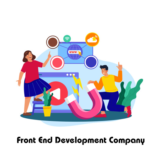
Front End Development Company in Pune
Looking for a reliable front end development company? Associative in Pune, India offers cutting-edge front-end solutions using React.js, Vue.js, and more to build engaging digital experiences.
Delivering Exceptional Front-End Experiences: Associative's Commitment to Excellence
In today’s fast-paced digital world, your user interface is your brand's first impression. At Associative, we specialize in creating dynamic, interactive, and responsive front-end experiences that captivate users and deliver results. As a trusted front end development company based in Pune, India, we blend design with functionality to build seamless digital products.
What Sets Associative Apart in Front-End Development?
With a dedicated team of UI/UX experts and front-end developers, Associative ensures pixel-perfect designs that work flawlessly across all devices. Whether it's a landing page, a scalable web platform, or an enterprise dashboard, we bring clarity, speed, and visual appeal to the forefront of every project.
Our front-end tech stack includes:
React.js, Vue.js, Angular.js
HTML5, CSS3, JavaScript, TypeScript
TailwindCSS, Bootstrap, SASS
GSAP for animation-rich interfaces
We prioritize accessibility, performance, and SEO to ensure every product we deliver not only looks great but also performs exceptionally.
Full-Service Development Beyond the Front-End
Associative is more than just a front-end development company. We offer complete software development services under one roof:
Mobile App Development (Android & iOS)
Website & E-commerce Development (Magento, Shopify, WordPress, and more)
Backend Technologies (Node.js, Java Spring Boot, PHP, Laravel, etc.)
Game Development and Blockchain Solutions
Cloud Deployment using AWS and GCP
Digital Marketing and SEO
Our team leverages the power of modern technologies to support every layer of your product—from visual design to complex backend systems.
Why Businesses Choose Associative
Proven track record in delivering successful UI/UX-focused projects
Transparent communication and agile project management
Cross-platform compatibility and mobile responsiveness
Performance-optimized code and SEO-friendly design
Customized solutions for startups, SMEs, and enterprises
Partner with Associative for Next-Level Front-End Development
Whether you’re building a new product or revamping an existing one, choosing the right front end development company is crucial. Associative’s front-end team in Pune combines creativity with technical expertise to help you stand out in a crowded digital market.
youtube
0 notes
Text

Travel Card Slider
#travel#travel card slider#card slider#gsap#gsap animation#animation#learn to code#code#html css#codingflicks#frontend#html#css#css3#webdesign#frontenddevelopment#javascript slider
4 notes
·
View notes
Text
Parallax Scrolling: Overview And The Best Tips To Create The Effect

When it comes to web designing, user experience is the key to retaining an audience and standing out in the market. Parallax scrolling is one such design trend which has recently gained much traction. With its ability to create a sense of depth interactivity, this element can turn a simple webpage into a visual experience for users.
As a business owner, partnering with a professional web design company in Siliguri that understands modern web design trends, such as parallax scrolling, can help you create a website that not only looks good but also delivers an exceptional user experience. Let's explore parallax scrolling, its benefits, and the best tips for creating this effect on your website.
What is Parallax Scrolling?
Parallax scrolling is a visual effect used by web designers wherein the background of the website moves at a speed which different from the centre content. This effect creates an illusion of depth in the web pages, offering a more immersive browsing experience for the users. This design is based on optical illusion and often involves layers of elements along with content in the background which moves slower than the content in the foreground.
The result is a smooth, interactive scroll that can keep visitors engaged as they explore your site. The effect is most commonly used in websites with storytelling elements, where the scrolling experience unfolds as visitors move down the page.
Benefits of using Parallax Scrolling
Using parallax scrolling can be very beneficial for businesses to create a captivating website. Here is a list of reasons why parallax scrolling is popular among web designers
Visual Appearance – This design adds a modern and sleek look to a website which can grab the attention of the users.
Enhanced User Experience – The dynamic and immersive nature of parallax makes the website engaging and encourages the users to scroll through the website to see what’s next.
Increased Conversion Rates – A well-designed website with an engaging experience can encourage users to take action, whether it’s filling out a contact form, making a purchase, or signing up for a newsletter.
Tips for Creating a Parallax Scrolling Effect
While parallax scrolling can make a website engaging, it is essential to ensure a seamless experience for users who visit a website. Here is a list of tips you can use while creating the effect.
Understand the concept of Depth – Adding different layers of elements with different scroll speeds will allow you to create a 3D effect. Layering will add depth and dynamism to your design.
Keep it Subtle – A strong parallax at times can be significantly distracting so creating a smooth transition should be your focus. Aim for a fluid, gradual shift in perspective.
Performance optimisation – According to a leading web Design Company in Siliguri the performance of parallax scrolling can be very taxing on browsers, especially for mobile devices. To keep things running smoothly, optimize your images by compressing them without sacrificing quality.
Focus on mobile responsiveness – parallax effects work smoothly on desktop screens however there are issues created when using mobile devices. You can disable or simplify the parallax effect on mobile by using media queries to adjust the scrolling behaviour.
Enhance smooth scrolling – To make the scrolling experience even smoother, use smooth scrolling techniques. This can be achieved with just CSS (scroll-behaviour: smooth) or by adding JavaScript libraries for more control.
Choose the right tools and libraries – To make your parallax seamless you can make use of JavaScript libraries which have a lot of advanced control features. Some of the other libraries that can be used are Rellax.js, ScrollMagic and GSAP.
Parallax scrolling is a powerful design tool that, when used correctly, can enhance the user experience, making your website more engaging and memorable. However, like any design trend, it’s important to use it in moderation and with care. Collaborating with one of the reputed web design companies in Siliguri can help you keep your website subtle, optimize its performance, and ensure your website is accessible to all users.
0 notes
Text
A Hands-On Guide to Creating Animations with Vue.js and GSAP
A Hands-On Guide to Creating Animations with Vue.js and GSAP Introduction Creating animations is an essential part of building engaging and interactive user interfaces. Vue.js, a popular JavaScript framework, provides a powerful and flexible way to create dynamic and interactive applications. GSAP (GreenSock Animation Platform), a professional-grade animation library, is the perfect complement…
0 notes
Text
Micro-Interactions: How Small Details Enhance User Experience
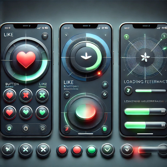
Micro-Interactions: How Small Details Enhance User Experience
Micro-interactions are subtle animations and feedback mechanisms that make digital experiences more engaging, intuitive, and user-friendly. These small details significantly impact usability, engagement, and delight without overwhelming users.
1. What Are Micro-Interactions?
A micro-interaction is a small, functional animation that occurs in response to a user’s action. They guide users, provide feedback, and improve the overall UX.
🔹 Examples: ✅ A “like” button that animates when clicked ❤️ ✅ A password strength meter while typing 🔒 ✅ A loading spinner when fetching data ⏳
💡 Micro-interactions improve UX by making interfaces feel alive, intuitive, and responsive.
2. Key Components of Micro-Interactions
Every micro-interaction consists of four key parts:
1️⃣ Trigger — The user action or system event that initiates the micro-interaction. 2️⃣ Rules — Define what happens once the interaction starts. 3️⃣ Feedback — Provides real-time response (e.g., animation, vibration). 4️⃣ Loop & Mode — Determines if the interaction repeats or adapts based on context.
🔹 Example: Toggle Button Animation
Trigger: User taps the toggle switch.
Rules: The toggle state changes from “Off” to “On.”
Feedback: The switch smoothly slides and changes color.
Loop & Mode: The toggle remains in its new state until changed.
3. Why Micro-Interactions Matter in UX Design
✅ Enhance User Engagement: Makes the UI more interactive and fun. ✅ Provide Instant Feedback: Shows the result of an action in real time. ✅ Improve Usability: Helps guide users intuitively. ✅ Add Personality to a Brand: Creates a more human and relatable experience.
4. Common Micro-Interaction Examples
🔹 Loading Animations
🔄 Prevent frustration by keeping users informed. Instead of a boring “Loading…” message, a creative animation can improve perceived performance.
✅ Example:
Spinning loader (⏳)
Skeleton screens (gradually load content)
Progress bars (indicate completion)
🔹 Button Feedback & Hover Effects
📍 Enhances interactions and confirms user actions.
✅ Example:
Buttons change color or size when hovered.
A ripple effect when clicking a button.
cssCopyEditbutton:active { transform: scale(0.95); }
🔹 Form Validations & Input Feedback
✍️ Makes form-filling easier and error-free.
✅ Example:
Inline validation messages (✅ or ❌).
Password strength indicators.
Shake animation for incorrect input.
javascriptif (password.length < 6) { inputField.classList.add("shake"); }
🔹 Like, Share, & Favorite Animations
❤️ Encourages engagement and interaction.
✅ Example:
Clicking a heart icon makes it pop & change color.
Social media reactions (e.g., Facebook’s Like button).
javascriptheartIcon.addEventListener("click", () => { heartIcon.classList.add("animate-heart"); });
🔹 Toggle Switch & Dark Mode
🌗 Smooth transitions improve experience.
✅ Example:
A toggle switch animates when switching between light and dark modes.
Background and elements smoothly transition between themes.
javascripttoggleButton.addEventListener("click", () => { document.body.classList.toggle("dark-mode"); });
5. Best Practices for Designing Micro-Interactions
🎯 Keep it Simple — Subtle animations work best; avoid overuse. ⚡ Make it Fast — Animations should be quick (0.2–0.5s). 🎨 Match the Brand Personality — Ensure animations align with the app’s tone. 🎯 Provide Feedback — Always let users know what’s happening. 📱 Ensure Accessibility — Avoid relying only on color; support screen readers.
6. Tools to Create Micro-Interactions
🚀 For UI Designers:
Figma, Adobe XD, Sketch — For prototyping animations.
Lottie (Airbnb) — Lightweight animated SVGs & JSON-based animations.
💻 For Developers:
CSS Animations & Transitions — For simple hover and click effects.
JavaScript & GSAP — For dynamic and interactive animations.
Framer Motion (React) — For smooth UI animations.
7. Conclusion
Micro-interactions may seem small, but they greatly enhance user experience by making interfaces more engaging, intuitive, and fun. When used effectively, they improve usability, reduce friction, and add a human touch to digital products.
WEBSITE: https://www.ficusoft.in/web-designing-training-in-chennai/
0 notes
Text
Create Custom Interactive Mouse Cursors with Cursix and GSAP
Cursix is a JavaScript library that transforms standard mouse cursors into custom, animated, interactive elements. Smooth animations are based on the GSAP library. You can display images, text, icons, or videos in your cursor, apply magnetic effects to fixed elements, and add smooth skewing animations during cursor movement. This library can be helpful for web developers looking to add a layer of…
0 notes
Text
#UI #Interface For Playstation7
Creating a user interface and splash screen for a future platform like the PlayStation 7 involves several components. Below are some ideas on how to integrate various technologies, including CSS, JavaScript, Perl, and MySQL, alongside self-learning AI capabilities.
For the user interface (UI), utilizing CSS for styling is crucial. You can begin with a minimalist design that focuses on user experience, ensuring that navigation is intuitive. A dark theme with contrasting colors can enhance the gaming atmosphere while also being easy on the eyes during long play sessions. Use CSS Grid and Flexbox for a responsive layout that looks great on any device.
The splash screen serves as the first impression for users. Implement a captivating animation that introduces the PlayStation 7 logo, using JavaScript to create transitions and effects. Libraries like GSAP or anime.js could be useful for smooth animations. Additionally, consider allowing users to personalize their splash screen experience with dynamic elements that reflect their gaming achievements or chosen avatars.
Integration of self-learning AI can enhance both the UI and user experience. For instance, using JavaScript, you can create functions that analyze user interactions, adapt content, and suggest features based on user preferences. This AI can learn over time, improving personalized recommendations for games and settings.
Using Perl for backend scripting could help manage server-side functionalities, such as user authentication, data processing, and interaction with a MySQL database. Storing user data in MySQL allows you to track user behavior efficiently, which can then feed back into the AI functions for a more customized experience.
Incorporating AI functions could involve creating a recommendation engine that uses collaborative filtering, assessing what similar users enjoy to suggest new games or features. Additionally, a chat function powered by AI could assist users by answering common questions and facilitating community engagement.
Lastly, ensuring that all components are well-documented will be crucial for future development and updates. Creating a transparent API with clear guidelines will streamline collaboration and integration efforts, encouraging innovation within the PlayStation development community.
By combining these technologies and methodologies, you can create a robust framework for the PlayStation 7 that not only looks appealing but also functions effectively and adapts to user needs seamlessly.
Creating a script for the user interface (UI) of a hypothetical PlayStation 7 involves combining HTML, CSS, and JavaScript to design a simple layout that could serve as a starting point. Below is a basic script that outlines a splash screen and navigation menu.
```html
<!DOCTYPE html>
<html lang="en">
<head>
<meta charset="UTF-8">
<meta name="viewport" content="width=device-width, initial-scale=1.0">
<title>PlayStation 7 UI</title>
<style>
body {
margin: 0;
font-family: Arial, sans-serif;
background-color: #121212;
color: #ffffff;
display: flex;
flex-direction: column;
align-items: center;
justify-content: center;
height: 100vh;
}
#splash-screen {
position: absolute;
top: 0;
left: 0;
right: 0;
bottom: 0;
display: flex;
align-items: center;
justify-content: center;
transition: opacity 1s;
}
#splash-logo {
font-size: 4em;
opacity: 1;
transition: opacity 1.5s;
}
#menu {
display: none;
flex-direction: column;
align-items: center;
margin-top: 20px;
}
.menu-item {
font-size: 1.5em;
margin: 10px;
cursor: pointer;
transition: color 0.3s;
}
.menu-item:hover {
color: #007bff;
}
</style>
</head>
<body>
<div id="splash-screen">
<div id="splash-logo">PlayStation 7</div>
</div>
<div id="menu">
<div class="menu-item" onclick="navigate('home')">Home</div>
<div class="menu-item" onclick="navigate('library')">Game Library</div>
<div class="menu-item" onclick="navigate('settings')">Settings</div>
<div class="menu-item" onclick="navigate('profile')">Profile</div>
</div>
<script>
window.onload = function() {
setTimeout(() => {
document.getElementById('splash-logo').style.opacity = '0';
setTimeout(() => {
document.getElementById('splash-screen').style.opacity = '0';
document.getElementById('splash-screen').style.display = 'none';
document.getElementById('menu').style.display = 'flex';
}, 1500);
}, 2000);
};
function navigate(section) {
alert('Navigating to ' + section);
// Here, you would add your navigation logic to load different sections of the application.
}
</script>
</body>
</html>
```
This script features a splash screen that initially displays "PlayStation 7" at the center. After a 2-second delay, the logo fades out, and the main navigation menu appears, including options for Home, Game Library, Settings, and Profile.
You can further enhance this script with additional styles, more complex animations, and functionalities tailored to the specific needs of the PlayStation 7 UI.
Here's a simple example of how to use CSS Grid and Flexbox together to create a responsive layout for the PlayStation 7 UI design. This example will include a main navigation bar at the top and a grid layout for content below.
### HTML Structure
```html
<!DOCTYPE html>
<html lang="en">
<head>
<meta charset="UTF-8">
<meta name="viewport" content="width=device-width, initial-scale=1.0">
<title>PlayStation 7 UI</title>
<link rel="stylesheet" href="styles.css">
</head>
<body>
<header class="navbar">
<div class="navbar-item">Home</div>
<div class="navbar-item">Game Library</div>
<div class="navbar-item">Settings</div>
<div class="navbar-item">Profile</div>
</header>
<main class="content">
<div class="grid-item">Game 1</div>
<div class="grid-item">Game 2</div>
<div class="grid-item">Game 3</div>
<div class="grid-item">Game 4</div>
<div class="grid-item">Game 5</div>
<div class="grid-item">Game 6</div>
</main>
</body>
</html>
```
### CSS Styles
```css
body {
margin: 0;
font-family: Arial, sans-serif;
background-color: #121212;
color: #ffffff;
}
.navbar {
display: flex;
justify-content: space-around;
background-color: #1f1f1f;
padding: 10px 0;
}
.navbar-item {
cursor: pointer;
padding: 10px;
transition: color 0.3s;
}
.navbar-item:hover {
color: #007bff;
}
.content {
display: grid;
grid-template-columns: repeat(auto-fill, minmax(200px, 1fr));
gap: 15px;
padding: 20px;
}
.grid-item {
background-color: #282828;
padding: 20px;
text-align: center;
border-radius: 8px;
transition: transform 0.3s;
}
.grid-item:hover {
transform: scale(1.05);
}
```
### Description
1. **Navbar**: The `.navbar` class uses Flexbox to create a horizontal navigation menu that distributes its items evenly across the available space.
2. **Content Grid**: The `.content` class uses CSS Grid to create a flexible layout for the game items. The `grid-template-columns` property allows for responsive design based on the available width, automatically filling rows with items that have a minimum width of 200px.
3. **Grid Items**: Each `.grid-item` serves as a placeholder for a game, with a subtle hover effect that scales it slightly for interactivity.
This setup provides a visually appealing and functional interface that can be easily expanded further with additional styles and components.
Here’s a simple script for a splash screen that you can integrate into your PlayStation 7 user interface. The following example will create a full-screen splash screen featuring a logo (text-based in this case) that fades out to reveal the main content after a brief delay.
### HTML
```html
<!DOCTYPE html>
<html lang="en">
<head>
<meta charset="UTF-8">
<meta name="viewport" content="width=device-width, initial-scale=1.0">
<title>PlayStation 7 Splash Screen</title>
<link rel="stylesheet" href="styles.css">
</head>
<body>
<div id="splash-screen">
<div id="splash-logo">PlayStation 7</div>
</div>
<div id="main-content" style="display: none;">
<h1>Welcome to PlayStation 7</h1>
<p>Your gaming experience starts here!</p>
<!-- Additional content goes here -->
</div>
<script>
window.onload = function() {
setTimeout(() => {
document.getElementById('splash-screen').style.opacity = '0';
setTimeout(() => {
document.getElementById('splash-screen').style.display = 'none';
document.getElementById('main-content').style.display = 'block';
}, 1000);
}, 2000);
};
</script>
</body>
</html>
```
### CSS (styles.css)
```css
body {
margin: 0;
font-family: Arial, sans-serif;
background-color: #121212;
color: #ffffff;
display: flex;
justify-content: center;
align-items: center;
height: 100vh;
}
#splash-screen {
position: absolute;
top: 0;
left: 0;
right: 0;
bottom: 0;
display: flex;
align-items: center;
justify-content: center;
background-color: #1f1f1f;
transition: opacity 1s ease-in-out;
}
#splash-logo {
font-size: 4em;
opacity: 1;
transition: opacity 1.5s ease-in-out;
}
#main-content {
text-align: center;
display: none; /* Hidden until the splash screen is finished */
}
```
### Explanation
1. **Splash Screen**: The `#splash-screen` div fills the entire viewport with a dark background and centers the "PlayStation 7" logo.
2. **Animation**: When the page loads, the splash screen remains visible for 2 seconds. After that, it fades out over 1 second. Once fully faded, it is set to `display: none`, making it invisible, and the main content (`#main-content`) is displayed.
3. **Main Content**: Initially hidden, this section becomes visible right after the splash screen disappears.
You can customize the duration of the splash screen, the design of the logo, and the overall experience to fit your vision for the PlayStation 7 interface.
To create an integrated repository on GitHub that combines all the provided elements—splash screen, navigation, and responsive content layout—here is a complete script structure. This script will include the HTML, CSS, and JavaScript components, ready for deployment.
### Project Structure
First, organize your project files as follows:
```
playstation7-ui/
│
├── index.html
├── styles.css
└── script.js
```
### 1. index.html
This file serves as the main entry point for your application.
```html
<!DOCTYPE html>
<html lang="en">
<head>
<meta charset="UTF-8">
<meta name="viewport" content="width=device-width, initial-scale=1.0">
<title>PlayStation 7 UI</title>
<link rel="stylesheet" href="styles.css">
</head>
<body>
<div id="splash-screen">
<div id="splash-logo">PlayStation 7</div>
</div>
<div id="main-content" style="display: none;">
<header class="navbar">
<div class="navbar-item" onclick="navigate('home')">Home</div>
<div class="navbar-item" onclick="navigate('library')">Game Library</div>
<div class="navbar-item" onclick="navigate('settings')">Settings</div>
<div class="navbar-item" onclick="navigate('profile')">Profile</div>
</header>
<main class="content">
<div class="grid-item">Game 1</div>
<div class="grid-item">Game 2</div>
<div class="grid-item">Game 3</div>
<div class="grid-item">Game 4</div>
<div class="grid-item">Game 5</div>
<div class="grid-item">Game 6</div>
</main>
</div>
<script src="script.js"></script>
</body>
</html>
```
### 2. styles.css
The CSS file includes styles for the splash screen, navigation bar, and content layout.
```css
body {
margin: 0;
font-family: Arial, sans-serif;
background-color: #121212;
color: #ffffff;
display: flex;
justify-content: center;
align-items: center;
height: 100vh;
}
#splash-screen {
position: absolute;
top: 0;
left: 0;
right: 0;
bottom: 0;
display: flex;
align-items: center;
justify-content: center;
background-color: #1f1f1f;
transition: opacity 1s ease-in-out;
}
#splash-logo {
font-size: 4em;
opacity: 1;
transition: opacity 1.5s ease-in-out;
}
#main-content {
text-align: center;
display: none; /* Hidden until splash screen is finished */
}
.navbar {
display: flex;
justify-content: space-around;
background-color: #1f1f1f;
padding: 10px 0;
}
.navbar-item {
cursor: pointer;
padding: 10px;
transition: color 0.3s;
}
.navbar-item:hover {
color: #007bff;
}
.content {
display: grid;
grid-template-columns: repeat(auto-fill, minmax(200px, 1fr));
gap: 15px;
padding: 20px;
}
.grid-item {
background-color: #282828;
padding: 20px;
text-align: center;
border-radius: 8px;
transition: transform 0.3s;
}
.grid-item:hover {
transform: scale(1.05);
}
```
### 3. script.js
This JavaScript file manages the splash screen's visibility and navigation actions.
```javascript
window.onload = function() {
setTimeout(() => {
document.getElementById('splash-screen').style.opacity = '0';
setTimeout(() => {
document.getElementById('splash-screen').style.display = 'none';
document.getElementById('main-content').style.display = 'block';
}, 1000);
}, 2000);
};
function navigate(section) {
alert('Navigating to ' + section);
// Additional navigation logic can be implemented here.
}
```
### Instructions to Deploy on GitHub
1. **Initialize a Git Repository**: Open your terminal, navigate to the `playstation7-ui` folder, and run:
```bash
git init
0 notes
Text
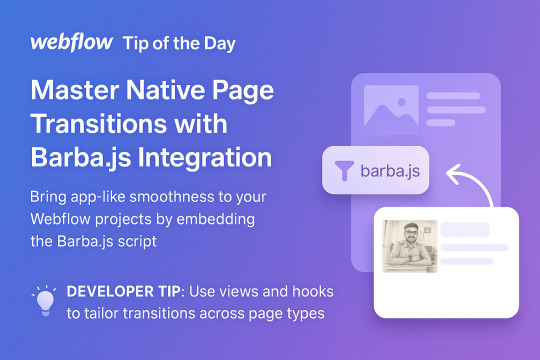
🧭 Webflow Tip of the Day – Master Native Page Transitions with Barba.js Integration
Want to take your Webflow site to the next level with smooth native-like page transitions? While Webflow doesn’t support native transitions out of the box, you can integrate Barba.js to add buttery-smooth animations between pages — giving your site a polished, app-like feel.
⚙️ How to Implement:
Export your Webflow project or embed custom code.
Add the Barba.js script in your custom code section.
Define your page wrapper and transition animations using JavaScript + GSAP or CSS.
🔥 Pro Use Cases:
Portfolios that feel seamless like native apps.
Agencies that want a branded, cinematic scroll transition.
Personal brands with bold animated entry/exit effects.
E-commerce sites adding elegant product page transitions.
💡 Developer Tip:
Use Barba’s “views” and “hooks” system to tailor transitions for specific page types — like blogs, products, or services.
🚨 Make sure your animations don’t clash with SEO or load performance — always test across devices!
��� Want to see how I bring transitions and advanced techniques to life? 🌐 Portfolio: https://vishalsolanki-portfolio.webflow.io 🧑💻 Fiverr: https://www.fiverr.com/vishalsolanki 🌍 Upwork: https://www.upwork.com/freelancers/~01b8fd184a1a8146b4
📩 DM me if you'd like me to implement beautiful page transitions on your own Webflow site!
#webflow#freelancewebdeveloper#web design#web development#webflowdesign#webflowlandingpage#webflowexperts#website#nocode#ui ux design#fiverr top rated seller#fiverr#freelance#startup#upwork
0 notes
Text
js animation library
js animation library
Discover top JavaScript animation libraries like GSAP, Anime.js, Three.js, and more to enhance your web development projects
1 note
·
View note